Loading page…
Mascot Logo Generator
Try:
0 / 160How to use Mascot Logo Generator
Make a mascot logo from a short character description. Use one clear shape for a small brand icon.
Describe one character and one feature that makes it stand out.
Generate the previews. Compare the shapes at a small size.
Choose a result. Check the download cost shown in the tool.
Example to try
A sleepy blue owl with a round body.
Check the result
Check the logo at a small size. Use the preview and download controls shown in the tool.
Example mascot logos
Every logo below came straight out of this tool from a one-line description. Click one to load its description and palette, then generate your own version.
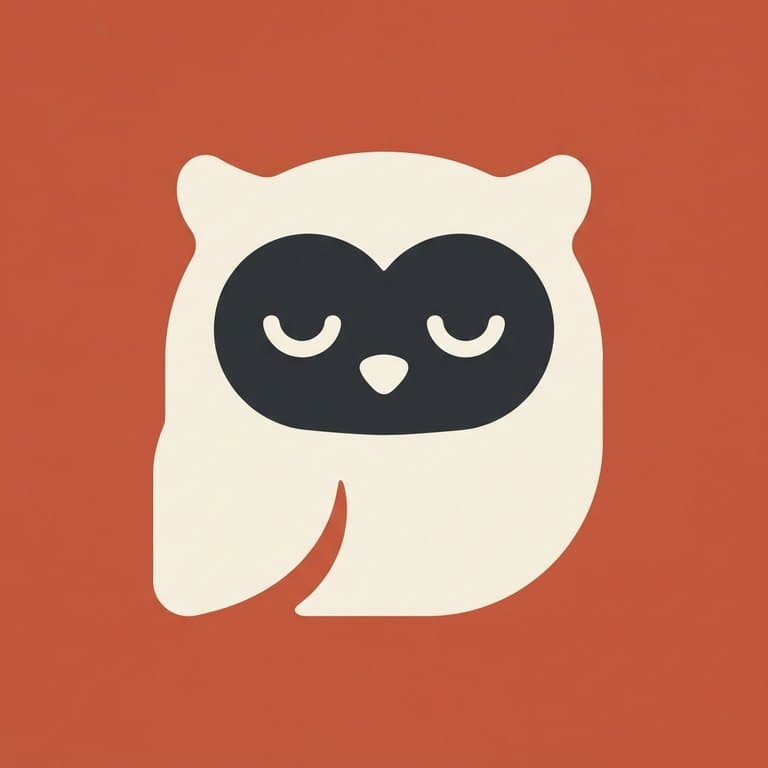
a sleepy owl
Terracotta · three colors

a friendly pufferfish
Denim · three colors

a hooded fox
Sage · two colors

a round robot with one wide visor
Midnight · three colors
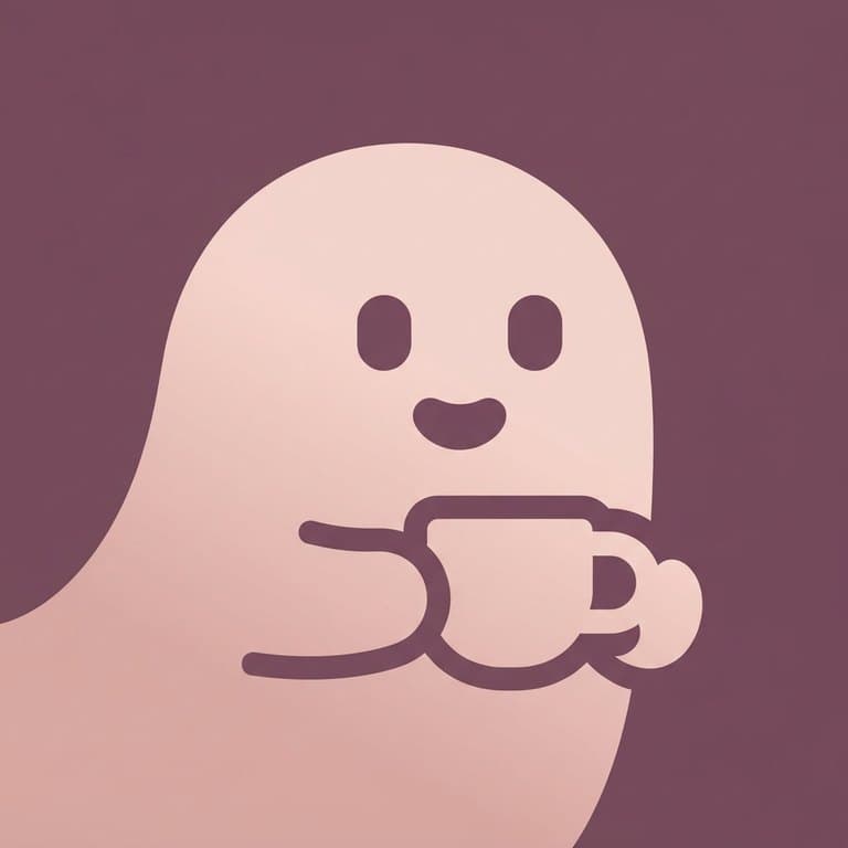
a ghost holding a coffee cup
Dusty Plum · two colors
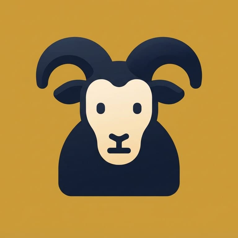
a mountain goat with curled horns
Ochre · three colors
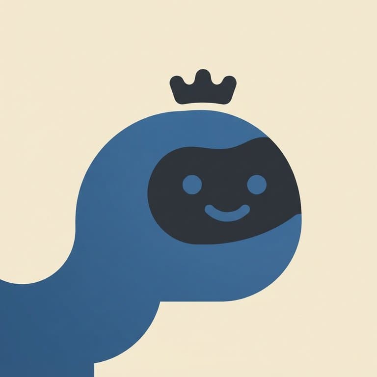
a whale with a tiny crown
Cream · three colors

a cactus with a mustache
Sage · three colors
Describe a character and this AI mascot logo maker reduces it to a compact square symbol — thick rounded shapes, two colors plus a background, and enough restraint that it still reads as an app icon at 32 × 32. Your first preview is free with no sign-up, and its clean, watermark-free original costs 1 💎; after that each logo is 1 💎, download included.
What makes a good mascot logo
A mascot logo is a symbol first and a character second. The generator holds to a strict complexity budget: one dominant silhouette built from six to ten basic shapes, at most one species-defining feature, two eyes and one mouth, and nothing in the way of feathers, scales, buttons, or texture. That is what separates a logo from an illustration — an illustration falls apart at favicon size, a logo does not.
Shapes stay thick and rounded. Every tip that would normally come to a point — ears, beaks, horns, tails — ends blunt, which is why these marks stay legible when they shrink. The mascot sits low in the frame and fills most of the canvas rather than floating in the middle like a sticker.
Color is deliberately narrow: two mascot colors plus one background, or a two-color version where the eyes and mouth cut straight through to the background. Depth comes from a single soft gradient inside each color region, never from a separate highlight shape, so the mark reads flat at small sizes and gains a little dimension up close.
Describe the subject plainly — “a sleepy owl”, “a round robot with one wide visor”, “a whale with a tiny crown”. Concrete nouns and one distinguishing detail work far better than a long brand brief.